Showing posts with label m2. Show all posts

Tuesday, 3 May 2011

More Impressionism research for theme 1

 Research for these have been taken from the internet: World Gallery site. 

Water Lily Pond by Claude Monet

This is one of the most famous paintings by one of the most famous impressionists.  It has a graceful quality and is full of spots of colourful light, or the effects of light a he saw it.  He did not focus so much on the objects within a scene but the light reflected from them to create great beauty.  Monet painted with the light which is what Steve says I must learn to do.

painting by Monet

This is another angle of the same scene but introducing more vivid colours together with the continuence of the arch of the bridge round to make a follow on flattened arch shape with the  coloured path. Thereby showing two different perspectives of the arch shape.  He shows a river path to the right of the image and a normal path to the left, similar in design to my image further down in this blog.


The Artists Garden by Claude Monet


Bluebell Wood
shutter 1/160 aperture f4.0 iso 200 Focal L 80mm

I took this image (the best of 5) on a visit to Calke the other week when I realised I had better go quick to capture the bluebells before they were beyond their best.  My sole intention of the visit was to just look for the bluebells and I only took 5 shots then went home.  I tried to find the angle where it looked like they were in a wood, and they were in a way, as  Calke grounds are made up of wooded areas,  but the bells were only in short expanses here and there along a specific walk way.  I walked up and down the path to determine which expanse would give a bigger impression in the frame, and which didn't have the clutter of fallen twigs amidst the blue carpet.   It was dusk when I went so there wasn't a great deal of light about beneath the canopy of the trees,  but there was some still coming through the trees.   I set up the tripod quite low as I wanted to be low to the bells, to include the trees with their foliage, and not much sky. The reason  I have included the image in this section, looking at the above 'Artists Garden' by Claude Monet, it appears to show a mass of similar coloured flowers with trees.  Again that image is more impressionist than mine, but I am pleased with my attempt.  I have enhanced the colours slightly in Photoshop and could always add more blur later if I wanted to.

 I have been longing to take a bluebell wood scene since I started with a manual camera, taking inspiration from magazines like Digital SLR Photography (April 2011 issue), as well as impressionist paintings.


Bluebell Walk  painting by Eric Forse

I came across the above image whilst searching the internet and included it because I loved the colours and it contains bluebells and trees.  The red of the path is a good contrast line to the water line, both of which carry you through the scene. I would love to be able to capture a scene like this and to such quality.

Water Lilies Garden by Claude Monet

In each of these Monet scenes,  his design includes water, trees and flowers ( exception being the above contains rushes instead of trees), and they are all vibrant nature images.

My monet
shutter 1/10 aperture f22 iso 100 Focal L 105mm

I took these 2 scenes (My monet at Calke and Low light at Matlock Bath) for my theme 1 of nature and focussing on the 'wood look' aspect within that, taking inspiration from Monet and Renoir painting scenes.  A camera Canon EOS 5D has been used throughout these images with a 24-105mm lens but the top was taken using the tripod and bottom without.  Therefore I was able to use a smaller aperture for the above one.  To my mind My monet holds a slight impressionistic look which could be emphasised more in phtoshop.  This is a crop of my original version which removed part of a large tree from the foreground left.

 Even though I had the tripod with me during my Matlock visit 'Low light'  was taken without, as we were walking from one place  to another and I caught sight of this scene at the side of us.  Liking the look,  I quickly composed and fired this shot.  I liked that the scene was going down at an angle, but the light was not really bright enough beneath the tree canopy so next time I would raise the iso setting.  With that said, this was the low light level as I saw it at the time, which attracted me.  

Low light
shutter 1/50 aperture f4.5 iso 200 Focal L 32mm

painting by Renoir

                                                             painting by  Claude Monet


Going back to a Renoir picture I featured earlier in a blog:

                                                               painting by Renoir

I now have a more comparitive shot:-

                                      shutter 1/200 aperture 4.5 iso 200 focal L 105mm

I now have a green and yellow scene with a man walking his dog down a tree lined path to compare to the Renoir painting above.  I took this shot on our day out at Matlock Bath (see previous blog), using Canon EOS 5D, 240105mm lens and a tripod.

 The man is walking in the  other direction however  in Renoir's painting, but as it is only an impression this is ok, though in my scene he plays a small part in comparison to being the main subject in Renoir's.   I have enriched the colours somewhat over the top, in an attempt  to achieve the bright impressionistic look of a painting.

The water shows reflective greens and yellows as does that of Renoir's.   My image is too busy though in that it has 2 paths, one of stone and that of the river and this, as Steve says, makes the eye wonder where it should focus.  I could crop to just include either path scene, but now I understand that I tend to do this, next time I would be more aware not to.  Either half of my scene would make a  nature shot,  I would probably favour the water side as being the more interesting. I did take another image from this same view point which shows more of the water side.


Both compositions follow the rule of thirds with the trees and the placement of the man and both show lines to lead the eye through the scene (paths and water), shape and pattern, and foremost are a focus on strong colour.
                                                                painting by Renoir

                                                                   painting by Renoir

                                                                   painting by Renoir

Equipment used:

Matlock Bath & Lumsdale Falls- with Research TomAng (theme 1)

Three of us from class (Stacey, Graham and me) went to Matlock Bath for the day to take photographs.  To prepare I ensured the  Canon EOS 5D camera was loaded with an empty flash card and full battery.  I took my tripod because I knew we would be also visiting a waterfall at Lumsdale.  I dressed in layers of warmth because we set out early morning and it was cool at the time and overcast, but I had checked the weather forecast prior and knew it would probably warm up later.  We were  lucky as it turned out to be beautiful, warm and I really enjoyed the day.

  Since I have been interested in photography I have wanted to capture the movement of water with some milky white effect in the flow.  My main intention was to experiment with different shutter speeds at Lumsdale Falls in order to achieve this goal.

I have been studying books and magazines throughout this course and one book that I purchased  entitled "How to Photograph Absolutely Everything" is by TomAng.  Herein I can look up tips from the sections that apply to my themes of nature and close ups. What I like about this book is that I can use it for reference purposes on anything I choose to take pictures of because it has a broad range of the basic tips and perspectives covering all subjects in one book.


I learned that waterfalls can be difficult to photograph, even for the professionals,  because the lighting can be tricky.  This is because it combines deep shadows with bright areas like dazzling snowy-white waters.  Additionally, to access the best vantage points can be challenging, if not dangerous, and I did find this.  The secret is to take my time, understand the environment and wait for good light, and to realise that less of a scene can be more.

                                                                  taken by TomAng

He took this scene using normal focal length to take in some of the surroundings but to keep the falls as the main subject.  Using a shutter of 1\60 he was able to capture some water droplets without making the flow too static. He used a medium to high iso setting.

                                                                           Water Slide
                                            shutter 0.3 aperture f14 iso 100 focal L 60mm

As in his picture, I compare mine here because I have framed the water to slide through the centre of the scene, albeit mine is taken from a different and I think more interesting viewpoint in my opinion. His straight on view does include a bottom part of the falls to give the more expanse of it though, and it would have been too difficult and dangerous for him to climb down those steep sides to take similar angles to mine.  I was lucky my venue gave more advantageous view points.

Composition:

 The compositions are similar in that they both hold similar colours and have lines to draw the eye through the whole scene. The main subject (the water) is the draw line in both images, starting in the background, coming down through the scene, to the bottom foreground showing some surrounding either side. Where his surroundings are mostly greenery, mine are mostly rocks and where they also differ is that mine is more of a cropped in look, making the water start at the edge of my frame (top and bottom) and does not include its end.  His  fuller view scene  however captures some background surroundings beyond the start of the fall and shows end calmness of the water at the bottom. Both images also show colour and shape and include water engulfed twig/branches in its later stages of fall.
  My  close shot is dramatic in that it highlights the speed of the flow, just as his does, with not too much surroundings either side to detract from that sense of speed, but incorporates just enough to give an idea of the type of venue in which it was taken.  The eye is immediately drawn to the waters as in TomAng's and this was my intention and focus.

Lighting:

I used a lower iso setting to TomAng's for the following reasons:
I read somewhere it is always better to use the lowest possible iso.
 I had the sun light directly shining on the falls.
 I wanted to add drama and impact.
 I had set the aperture to attain some details throughout, so I knew it would result in the camera choosing a slower shutter speed for correct exposure, giving me what I wanted to obtain milk.

As previously mentioned lighting can be tricky and here you see deep shadows to the right of both images. I think this can add to the feel of a picture though and sometimes aid its mystery.  I prefer the lighting in my scene, firstly because I love dappled effects, like a painter has just dotted light here and there, but also the brightness of how the sun has caught the main part of the falls adds to its drama.

In such high contrast subjects where the camera can wrongly assume there is more light available than there is, because of the dazzly white waters for instance, it compensates by either increasing the shutter speed or stopping down the aperture.   Photographers can choose to either carry light meters to combat this or use compensating controls on their camera ie. to compensate by over exposing slightly, say 2/3 of a stop over for bright whites.  Here I relied on the camera's automatic light-metering system and I had it set on the Evaluative metering mode.

 My slow shutter speed doesn't really show any water droplets to speak of, because my aim was to attain the smoothness of milk rather than the individual droplet texture and I was pleased that I managed to get the results I wanted.  Dramatic scenery can work well in either the landscape or portrait formats; my preference in photography is always landscape first and here this shows, where as TomAng went for the portrait.  His portrait format does capture more expanse of the water, a more full view overall because of the shape of the subject ie. the waters come down.

 With this type of subject you can obtain sharp images of moving water with short shutter times but the results may look too static.  Longer exposures give the milky effect and a sense of movement, so it is best to experiment with different shutter speeds to see which effect you prefer.

 It is a good idea to explore the area because on first sight the obvious 'see' to take may not turn out be the best one and a position that is not promising at first may be perfect once the sun has moved a little.  I should explore slowly, carefully and safely.  From a health and safety point I should be aware of eagerness to stomp through  the waters on route to instinctive vantage points, where water covered rocks may be very slippery and hazardous to my equipment and myself if I were to slip and fall in.

I took other shots of the falls from different vantage points:-

                                           shutter 0.4 sec aperture f14 iso 100 focal L 24mm

For these two shots I moved further down the falls each time (albeit on all fours) gaining more and more surroundings in the frame and lengthening the view of the waters.  I still wanted to retain smooth milk but wanted to also capture its patterns passing over different rocks, in effect taking in more bright white stages.  I have more mottled light patterns in these images along the rocks because I have included more rocks.  I still also have some deep shadows, which I like because they give mood and some the impression of hidden caves.

                                         shutter 0.5 sec aperture f14 iso 100 focal L 24mm


                                                                    Liquid Motion
                                          shutter 0.6 aperture f14 iso 100 focal L 28mm

These are my favourite images of the day and I like to give names to scenes I like best.  I think I  managed to capture the things I was looking for in a waterfall setting: impact, mood, milky flow patterns,  mosey green rock surroundings,  and I like the light that I was lucky enough to capture at the time.  I had to wade through the water to get this image, with the help of another's hand and tripod, so great thanks goes to them!

                                                   shutter 1" aperture f14 iso 100 focal L 28mm

I took a total of 20 shots of this same scene with different shutter settings ranging from 0.3 of a second to 1 second, and as I did so the light was changing too with the sun.  You can see there is more mood in the top scene because it is darker, making the falls stand outside the scene more (if you sit back) but the bottom one shows more detail in the rocks, due to the slightly longer shutter and the fact that I stepped back one pace to include forefront sun lit rocks, from sun coming from the left.  I wonder if this could be slightly distracting the eye from the main subject of the falls though? All the shots were taken with the Canon EOS 5D with 24-105mm lens and the use of a tripod.

What would I do differently next time:

 Not a lot as I am very pleased with the images and I took my time over taking them.  I could experiment with different settings on the camera ie. maybe try out the spot metering if I thought the shadows were too dark, whereby it would take the light reading from just one specific area.
 I could experiment increasing the iso setting too, as I did keep that on iso 100 throughout, for reasons explained above.
  I could also experiment more with different apertures because I held that on the same  f14 at the falls, once I had found a look I liked ( by checking the initial shots on the camera).
 I would like to carry a lighter tripod around on full day trips, because I hadn't managed to make up my mind about one beforehand.
 I might  have something to drink during the day, as we were that engrossed, only stopping for fish and chips, until early evening, when we had some refreshing drink....I was so thirsty!  All in all I enjoyed a great day with great company.

More images from TomAng's book and website:-

                                                                        by TomAng

For me TomAng's work here is about stretch and perspective.  A subject stretching throughout its frame, (be it the water fall, trees, cloud formation, or flower show), and/or with a stretched perspective of view, stretching upwards, horizontally or on the diagonal.

My image below, named aptly so, was taken at Matlock Bath and shows the stretch of the ducks wings outward, the stretch and depth of the stepped path from the foreground reaching back to  the stretch of the bridge in the background horizontally.


                                                                             Stretch
                                           shutter 1/1328 aperture f4.0 iso 200  FL 102mm


                                                                      by TomAng

                                                                        by TomAng

                                                                       by TomAng

                                                                       by TomAng

                                                                       by TomAng

I love Tom Ang's  water scene above for its design and colour.  I had planned to take more water scenes for my level 2 work than I did during level 1 and thus have been researching images containing water.

 I was experimenting when I took 'Magic Wand' (below),  a shot of a brook close to home, then ended up really liking the image for its simplicity.  I used the same aperture that I had used when taking my water fall scenes at Matlock Bath,  because I thought those had taken well and had given me the level of detail I now sought again.  I shot the scene at dusk into the sun and because the brook was part shaded by trees, the light diffused nicely.  This is a crop of the original that had a bit of fence showing at the top, which I decided wasn't necessary.

 An erray of 'lighted' shades of green is my composition to compare with TomAng's and though mine does not actually show the water colours,  it does shows the suns light reflecting on it , and its brightness aspects are what set the scene off.   Just as with TomAng's bright centre draws the eye inward, then out and around, I think the eye is drawn to the high reflected parts of mine first then follow up the brook through the scene.  Tom's composition shows his greenery and lines stretching throughout his frame horizontally whereas mine is on the vertical, with the brook line stretching in my image centre to lead the eye through.  I was pleased to see a star had formed in the reflections,  which to me looked like a magic wand.

                                                                          Magic Wand
                                                shutter 1/8 sec aperture f14 iso 100 Fl 88mm


                                                                       by TomAng

                                                                       by TomAng

                                                                    taken by TomAng

                                                                      by TomAng

I think this image gives a look of stretched blur which lends to impressionism.

Wednesday, 6 April 2011

Practising the Dreamy

shutter 1/6 aperture f22 iso 200 focal L 82mm

Steve had suggested I try moving the camera slightly on slow shutter speeds and experiment with different shutter speeds so this is what I was attempting with these shots.

They do  look more dreamy to me.  Again I went out in the garden experimenting with a Canon Eos 5D camera, with 24-105mm Lens,  hand held on a windy day, so there was some movement in the branches/plants but I also moved the camera more as I took the shots.  I started to focus using a centre focussing meter then as I release the shutter I moved the camera up or down at varying degrees until I discovered that moving the camera to the right or left just a little way on release of the shutter proved better results.  I also used a slower shutter than  the last time I tried this exercise, and I think the results are better.  In the above image I like the cut off line with the blue and white sky running diagonally.  


shutter 1.0 aperture f22 iso 250 focal L 97mm

This one lacks lustre but it is all blurred, by moving the camera slightly to the right as I released the shutter.


                                                  shutter 1.0 aperture f22 iso 320 focal L 105mm

The above  looks more painting like I think: a ghost sweeping through the conifers.  I had moved the camera left and right as I released the shutter.

He had also suggested I take one clear shot and one blur one...  The second image below is where I tried moving the camera up and down:

                                        
                                               shutter 1/5 aperture f22 iso 320 focal L 105mm


On viewing,  I decided I preferred the effects of  moving the camera sideways.

Sally Apfelbaum ( for theme 2)


 These are close up images taken by Sally Apfelbaum.  The first one is quite busy it shows the rule of thirds in the positioning of the red flowers and also shows the contrasts of the blur with the focus.  Details are there where it is in focus and the blurry stems lead the eye up to these focussed features, top left of the scene. The perpective is intresting as it appears to be looking down on as well as looking through to the flowers. It shows perspective, shape, lines and colour.

                                                             taken by Sally Apfelbaum


I compare my image above to that of Sally Apfelbaum's in a compositional way and of showing the contrasts of the soft  flowers to the hard sharp stems and the way we have both used the rule of thirds in a similar way. I chose to blur some of the flower heads but not all of them showing some clarity like she has the focus on the left middle pink flower.  Her top left background thin stalk is very aparent, as is that of my bottom right fore front thin stalk.

                                                             taken by Sally Apfelbaum

This black and white shot shows textures, hard and soft looking and shows form of the flowers as they are well focussed, that of the spikes, leaving only the background to fade into blur.   She uses the rule of thirds in an horizontal way, and a similar perspective is produced ie. it looks like the camera looks down on the bottom flower, and fro  the side of the top flower, because of its size,  so this image highlights scale, form and shape.  I do not have an image that would justify black and white yet.


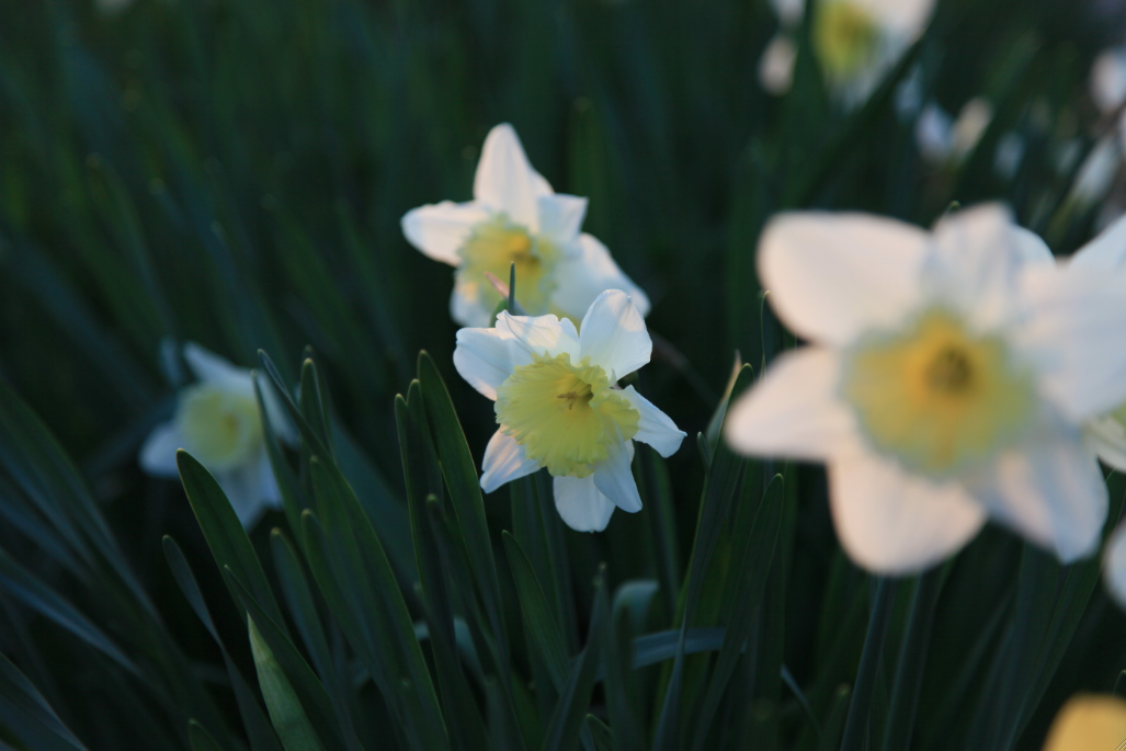
I took this image in my garden at dusk  and compare this one with Sally Afelbaum's top image: - as flowers go off the frame to the left and you can look down on some flower heads whilst others are viewed from the side.  There are the  main colours of white petals with inner  yellow centres together with  green stems,  comparative to the pink petals with inner lilac centres together with green stems.  I also show texture of the leaf, being sharp against the softness of the blurred flowers as in Sally Apelbaum's.   I set focus on the centre leaves to show their clarity, throwing the flowers out of focus, though they are not as blurred as in Sally's top picture.  I have used the rule of thirds however in a similar way, with the separation of the flower heads.  I am pleased with the colours, composition and details showing and the way a hint of pink can be seen in the broken flower shown in the left rule of thirds vertical line.


I took this images at dusk with a Cannon Eos 5D camera hand held on a centre focussing meter.  Using the sun to backlight the petals in the top image, I laid down in the street where I live to angle at the flower eye level, and focussed for only the front flower to be clear. I had been driving home from work when I noticed how the light was catching the flowers on approach to my drive and quickly went in doors to grab the camera.  I did get muck on the sleeves of my uniform jacket lying in the soil parts, but it didn't matter  if the shots worked.   The above shows the scale of the fore front flower  to the size they looked taken a little distance away, as in the background two which I decided to throw out of focus.  I like the way the sunlight catches the inner centre yellow core and the details showing contrasts of curly and rounded edged petals.   If you zoom into the flower you see detailed core arms.  I am pleased with both these shots.

Throughout Sally's images in this blog and the previous one her theme seems to be using contrasting  hard/sharpe objects with the softness of blur.

Here are more images I took:


I am showing different colours and shapes of the open/closed petals here contrasting to the straight lines of the stalks.  There is more depth showing too.


I am showing scale here with the sizes of the flowers growing at different heights and the tips of the stems grown at their height top.


I like this one the way the stems curl round and over and capturing 2 different  two tone colour heads at opposite angles with the curly stems between.  There is also some space in the background of this one so compare that aspect to  Sally Apflebaum's.


I like the bright whiteness of this one and the contrasting petal shapes to the more plainer green background.


I like this one for the inclusion of the soil bits and the draping grasses bending in various directions that somehow seem organised, so I tried to set the middle flower in the centre of this organisation. On  later inspection  I was pleased to see I had unknowingly included a ladybird on a right back stem.  This composition is about lines of the grasses, pattern of the grasses, flowers and soil clumps, shapes of the flowers, grasses and stones and colour.  It is also about contrast between the hard (soil clumps and stones) to the softness of the flowers.  This also relates my comparison to Sally Apfelbaum's images of hard and soft contrasts.