Showing posts with label m3. Show all posts

Thursday, 9 June 2011

Digital Masking and Selection

I have taken 2 images to demonstrate the use of masking and selection:


The image on the left shows where I have taken part of the image on the right (a selection) and painted it onto the image on the left.  By using the healing brush tool and clicking on the daffodil yellow centre, I then painted it onto the other image... by clicking and holding down the mouse while you paint over the area you want.  The more you paint, the more daffodil appears.

These are the 2 images I started with by placing them both in photoshop


This shows the selection of daffodil painted onto the left image.

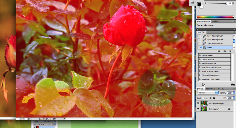
Then I looked at using the quick mask icon at the bottom of the tool box and when used this paints in red.  You click on the tool and paint over the image in areas where you want to mask, (protecting that part of the image underneath). Painting over areas in red will reveal the image below in these areas, for adjustment, then you click image, adjustments, 'revert' and it places the marching ants around the selections.  As you then use the adjustment sliders ie. brightness/contrast you see how the objects within the selections are adjusted.  You can revert back (or press Q) to change between the screens to adjust the rest of the scene, or none selections. 


You can see the painted out (masked) parts here. Any adjustments will only be applied to the other parts of the scene, once the marching ants are revealed around the selections:

You can then change settings ie. contrast and brightness to effect specific areas of the image:

The above shows all the remaining objects are selected for adjustment.

Then you can click on image, adjustments, revert, so that the selections are the adjustable areas.


Above I used a different image to experiment with masking techniques, as the screen grabs show, where I painted in red and tried some techniques:


This shows how the red paint seems to seep into the backgound.


This shows how the brightness and contrast effects the selections.

You can paint over all the background so that the only selection showing is the part that is affected by any adjustments, and visa versa following the same process as described above.


You can use the 'invert' to apply adjustments to the background and not the selected painted mask area.

By inverting you effectively switching the 'viewed' selections, to either the painted top parts or the non painted underneath parts.


This shows how you can look 'through' the mask (the red painted area) to see how adjustments now effect the underneath green background selections.


Tuesday, 7 June 2011

digital Manipulation - a before and after image - the dreamy

 Using the dreamy image again I experimented with colours, curves, blend modes and filters:-

                                     1.                             original image

                                  2.     I adjusted the colour balance again by adding a new layer.


3.          Here I added a brightness layer


4.

 I added a photo filter 'hard yellow' layer with a pin light blend. I was also taking the 'eye' off different levels to check their effects.

5.

I could see my original image held more forefront green grass (but this was abit drab looking) and that once I added the hard yellow filter there was too much yellow, so I decided to combine the original image with the amended version, also placing my original in photoshop and experimenting with  the opacity and fill levels to see what happened.


6.

This put more green of the grass in with the yellow and looks very bright, but the opacity would need to be turned down because the yellows were now competing with the reds in boldness.

7.

This was better as it showed the yellow pattern that I wanted to highlight in the stem of the full main flower (left of the image) which remind me of a glass stem.  It also shows a mix of yellows in with the green grass to bring the picture alive.

                                                      the history box shows my actions

                                                        
Other setting that I tried from a fresh original:

                                     8.   Here I used the curves to adjust the contrasts and colours.


                                            9.   I was experimenting with overall colour changes.  I  quite like this unusual effect because  the glass stem has a nice highlight contrast. I would like to make the stem stand out more next time.

10.

                                                             11.

                                                          12.

These images show more contrast inside the flower cups than image 7 above.

                                                   13.

Still experimenting I was looking at the channels and how a 'RGB' image is made up of red, green and blue.  It looked like an eerie face formed here. I saved my images in file formats psd and jpgs. The psd ones I will be able to return to for further amendments if required. The jpgs are ready if I chose to use them for presentation.

Thursday, 26 May 2011

A before and after image - digital manipulation

I need to start experimenting with my images in Photoshop to see different effects and decide which ones I like best.  I have been out and took some more images at close range with a limited depth of field, so I will look at some of these.

                                                         This was the original image


 I placed the image in photoshop and clicked Layer, duplicate layer to achieve a duplicate copy of the original.  I then pressed shift, comand and '4' to do a screen grab (photo) of this start, as shown above.

I will continue to screen grab as I go along to show all my workings, as my demonstration for my Assignment 215 (Digital Image Manipulation):-


Next I pressed Layer, new adjustment layer and went onto the vibrance level:

  
I changed the controls to vibrance +68, saturation -49 to see the effects. This look makes all look alittle subdued and gloomy.

Picture 4 shows I changed these controls to vibrance -46 and saturation +73. I like the colours saturated more here because the pink now stands out in the flower and the green hues background have a nice old world effect.

Next I thought I would look at the clone tool to see what effect adding more flowers to the stem  would look like. I clicked on the brush tool and chose one from the brush pallette:


I as go along looking at the different effects I press the 'eye' icon on and off to see the before and after look:
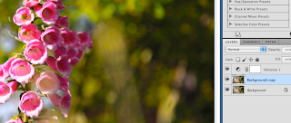


These screen grab pictures show the 'eye' off (no effect on the layer) and the  'eye' on (with the effect)
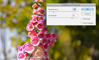

 These pictures show where I used the lasso tool to experiment to select a specific area for adjustment, changing the controls to brightness -99 and contrast 60:


Looking at the window tab at the top of the screen the list (above) shows me what is on (ticked items) and what is not active.  ie. If I pulled out of layers, it would not have a tick next to it.

The History box  (found in the widow tab) is also a list to show me what tools I have used and what steps I have taken.


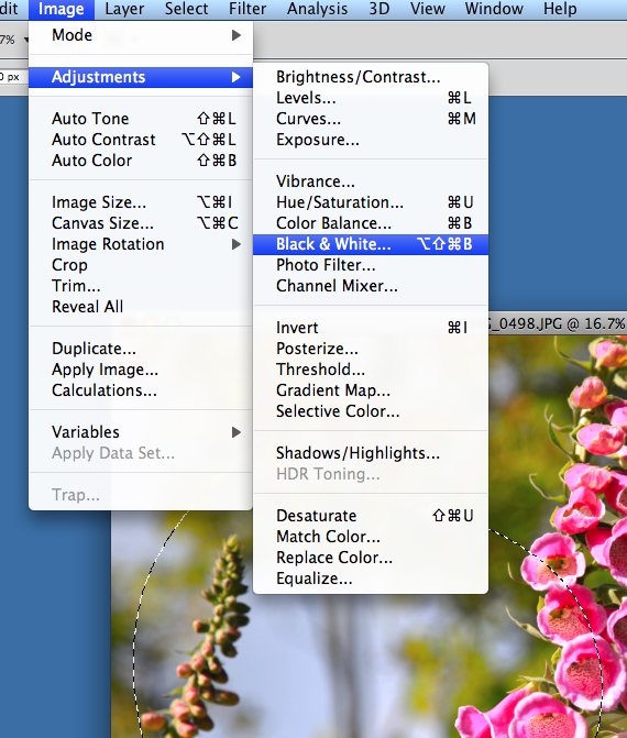
I thought I would look at the effect of black and white on my image:


Nothing really stands out in this black and white effect because in a flower image contrasts are softer and there are no hard lines.

I also tried playing with the colour levels on the selected part of the image:


Ticking and un-ticking the preview box shows the effects on and off:


Next I wanted to look at a close up of a certain part of the image to see how a close crop would look:


Next I wanted to look at a filter effect:

I could add a new adjustment layer to do this.  By creating more layers I would have more control over my adjustments; I could click on each layer at a time and with the 'eye' on and off in each layer panel,  see their individual effects.


Next I used a warming filter 85 to an 83% density level:

I like this effect because it gives me the impressionistic look background in vivid colours with warmth.

I thought I would just check to see what the image now looks like without the vibrance on;  so I unclicked the 'eye' icon for the vibrance level:

The effect looks light the light has been switched off on the image.

The impressionistic background look is still here without the vibrance. I like this look too, but it gives it that bit more with the vibrance on.

Bee Flower
shutter 1/500 aperture f4.0 iso 100 FL 105mm

I decided this was the best look because the vibrancy gave the image the feel of a warm sunny day and made the centre flower stand out. The eye focusses on the main subject now without the distracting blue sky in the background.  The adding of the warming filter filled this sky gap (middle left of the image) making the background more of a whole.  Though I liked the zoomed in look of the part of the flower with the bee in,  I thought it was not descriptive enough to be a whole picture.  I wanted the flower in its context and that context to show an impressionistic feel and era.   The budded flower to the left has been left in the image to add balance and scale to the composition and I like the way it portrays the contrast of a flower in bud against the open one.  In reality further down that closed bud stem, there are open flowers too, but my scene was to depict the contrast of them both within their setting.  I consider my original image to be nice, but this improved image has more punch, giving a composition make up of colour, shape, pattern and scale.

Output techniques:

I saved as a jpeg after adjustments ready for showing on my blog.