I have been experimenting with a need to change an image to black and white. I chose this because I thought it would work well due to its contrast tones, lines and shape:
Bath Time
shutter 1/125 aperture f11 iso 200 FL 80mm
This is the original image taken in colour. I took the picture on my day out at Matlock Bath. I had to take it hand held to be quick and I was lucky I managed to get so close. I was sat on the steps taking from an eye level focal point.
I duplicated the background layer then clicked on adjustments and desaturate.
First Method:
"If you completely desaturate a colour image, you remove the colour data to give just a greyscale. However it is still a colour image and looks grey because every pixel has its red, green and blue information in balance. Because of this, the information is self-cancelling and the colour disappears."
Using another method:
"If you select different colours to desaturate, you can change the balance of tones. Converting the image to greyscale at this point gives you a different result from a straight conversion, since the colours that you first desaturate become lighter than they otherwise would have been."
(Quotes taken from the Digital Photographer's Handbook by TomAng page 276)
The first method I used to convert to black and white shows how dark the shadows are on the left initially, so I adjusted the brightness and contrast levels and the one below is lighter in the shadows.
Taking the 'eye' on and off shows the difference in the 2 above images, one lighter and one darker.
I opened the History box to screen grab a copy to show what I was doing.
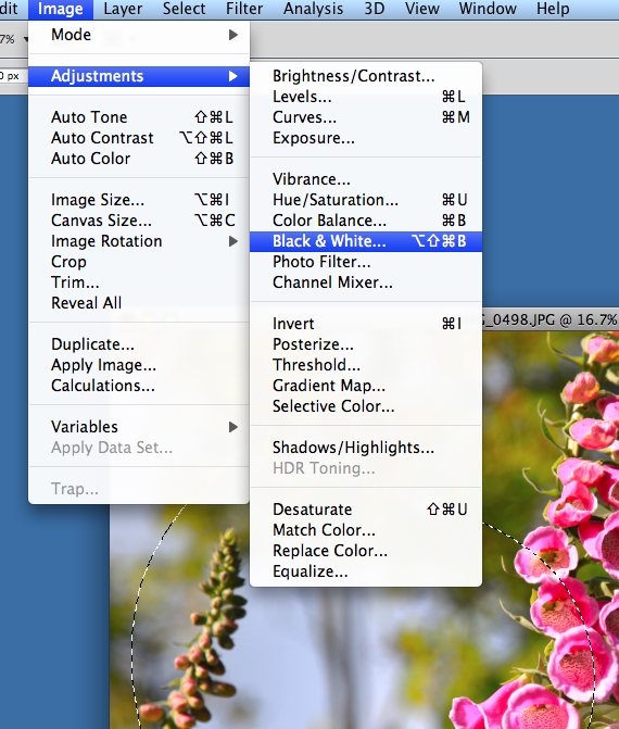
The image above shows my second method to convert to black and white, by simply clicking on the 'black and white' option in a drop down box (after selecting the icon for new adjustment layer). Again this method results in the same dark shadows initially, but more adjustment slider levels became available (see second image down).
Black and white
The black and white, left with the dark shadows shows off the contrast tones of the white ducks to the grey tones of the other subject matter ie. the stone, water, trees and bridge. The ducks shapes are emphasised. Contrast textures can be seen with the soft features, and hard concrete steps, and the softness of the water to the hardness of the bridge. The light is emphased... I particularly like the rim of light around the forefront baby duck and the hint of light showing in the distance (background left) of the river bank.
You can also make images black and white conversions through "channel extraction" on the channels layer:-
These images show the effects with the 'eye' on and off different layers in the channels box and how the tone levels can also be experimented with.
The above shows that by just looking at the green channel (eye only on the green channel) and extracting the other colour channel boxes, the image turns black and white. Below shows by just looking at the blue channel box, black and white is rendered. However and reflecting back to what TomAng said there are differences in the balance of tones (see 'Using another method above) and this channel extraction way has produced lighter initial tones in the shadows compared to the first method.
A navigator box (small insert in above) shows how the black and white image can be compared to the coloured original.
A history box shows the actions taken
Reflecting back to TomAng I can clearly see tonal balance at work in these images.
I used another image to show the second method in action, where I converted to black and white and adjusted the colour levels:-
Torches
shutter 1.3" aperture F4.0 iso 100 FL 102mm
I took Torches in my garden after a downpour of rain when I noticed the raindrops and the way light was reflecting on them on the roses. I used a tripod to enable me to capture the detail better and in choosing a wide aperture and low iso for the same reasons, the camera chose a slow shutter. I got down at a low angle to take from an upward stance and my focal point (in spot metering) was on the rose head.
I thought this image might convert well to black and white because of its deep red colour contrast to the leaves and the compositional shapes, pattern and lines. What I do like about this one is the way little touches seem to be lit inside the rose bud.
This simple route in then brings up the colour levels sliders for adjustments:-
You can see how I changed the levels this time to make the now white rose stand out from the other dark grey tones.
White rose
You can also give this look a tint effect:-
tinted rose
You can see by even giving a tint here, the white of the rose does not stand out as much as in the black and white version, above it. The lighting also looks better in the black and white one, the rain drops look more apparent on the leaves. In my opinion the coloured rose image does not stand out as much as the black and white conversion. It is short on impact. The black and white look captures more impact I think, escpecially on first quick glance of it. The little torch effects are lost however due to the fact that the red contrasted so well with their white light, but turning the rose to white, they do not stand out against it. In conclusion: a black and white image can be more powerful than colour in certain imagery.
On reflection I concluded that you far more flexibility with the 'black and white' selection route than the desaturation route because you get more control levels for finer adjustments.
So then I experimented, with another black and white conversion using this same route of getting to the black and white stage, but then taking the controls further to give a different high key type of effect:-
I used a different rose image, one which I considered had more stem leaf shades of colour that would be enhanced by a conversion to black and white:
The following screen grabs show my processing:
I liked the effect here but wanted more high key
I experimented with the colour levels until I was happy, being careful not to go too far and lose more detail.
these are the final controls I settled on
High rose
shutter 0.3 sec aperture f4.0iso 100 Fl 67mm
I am pleased with this effect. I was trying to achieve a high key look. The different stem shades of green really do extend to more contrast and highlights as I had supposed. Also this way the background distracting rose blends into the scene better. Interestingly the folding out petal on the bottom left of the rose head now appears to look like a run of liquid, and I like the liquid effect inside the rose head.
Output/presentation:
When happy with the images I can save them as 'jpegs' to use on my blog, the gallery web site that is being set up by the college and tv screen, which will be in the college to display students work for approximately 2 weeks. I would simply do a 'save' or 'save as' from the 'file' drop down box and on the following the pop up boxes can select the 'jpeg' option with a preset of 'jpeg high' to give the best quality.
You can also convert images to black and white via the channel mixer control (page 280 Digital Photographer's Handbook):
Research:-
I am pleased with the effects here and I have learned how there is much versatility within black and white imagery.
Equipment used: Photoshop CS5 plus:


 -
-